Drawing Perspective with Two Eyes and One Brain
Drawing perspective is easier than you might think, and it's a priceless tool for an animator.
You need it for character animation, for background drawings and layout, and even if you work with a 3D software, understanding the tricks that create the illusion of depth can spice up your work a great deal.
This article has two parts:
Theory – What does our brain need in order to perceive depth?
Practice – How to draw perspective with a single vanishing point (tutorial)
Theory of Perspective
In order to draw perspective, we need to understand how our brain perceives depth.
Human vision in itself is rather poor.
Only a small part of our field of vision is actually in focus, and only the center of it is in color.
Not to mention the image that comes from the lens is, in fact, UPSIDE-DOWN.
Our brain puts in a lot of work in order to interpret the image transmitted to it from the eyes.
Remember, that the image of light created on the retina is just as 2D as any sheet of paper. There is extensive research as to how we understand the space around us. For our purpose as artists, we can boil it down to these principles:
Visual Experience
Humans have two eyes.
It’s been argued that we need both to sense depth – but that is not all true.
There are many things that we can see with just one eye, and use our experience to determine what they mean in terms of spatial arrangement:
Monocular Cues - one eye is enough for:
1. Linear Perspective
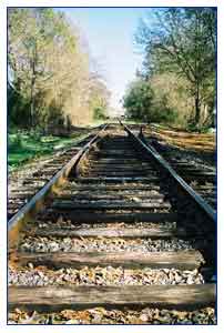 Linear perspective of railway tracks Linear perspective of railway tracks |
Parallel lines appear to converge at a vanishing point on the horizon. This is the first of the optical illusions that make up our sense of perspective, and you only need one eye to see it. Your experience in life fills in the rest. Linear Perspective happens in all three dimensions.
Every straight edge in the world can converge at a vanishing point, and give the illusion of depth. |
2. Image size on the retina
We “see” an object when the light reflected from it falls on our retina, and creates an image there.
If we see two objects, and we know in advance that they are the same size, then the relative size of their image on our retina will "clue us in" as to who is closer.
So:
Bigger = Closer
But this is only a relative comparison, it cannot tell us how big things are, only create a hierarchy of proximity.
This is one of the reasons why a jumbo-jet seems to just hang in the air. Most people do not have an estimation of how huge it is. Therefore, we cannot judge its distance from us, and therefore we cannot tell how fast it’s moving – and we try to fit it into our immediate experience, say, compare it to a bus.
Also, there is usually nothing in the air that we can compare the plane against.
It looks all wrong, because we rely so much on prior knowledge.
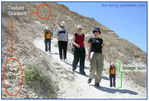 Image size needs to be in context. This applies to the rocks as well as to the humans.
3. Texture Gradient
Objects appear smaller and smaller as they get further from us.
The squares on the sidewalk will therefore look smaller and smaller the further we look.
Use this when you draw layouts, especially outdoor scenes.
4. Relative proximity to the horizon
The horizon is the imaginary line where the earth meets the sky, and where all lines converge.
When drawing perspective - ALWAYS know where the horizon is!
Objects near the horizon look bigger than objects that are far from it.
This assumption is stronger than the Bigger=Closer assumption.
If you place two identical figures in a picture, and put the feet of one of them closer to the horizon than the feet of the other, the one on the the horizon will seem to be further and bigger.
Our brain gives a higher importance to the horizon, and forces all other assumptions to get along with it.
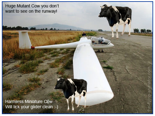 Holy Cow! Both cows are exactly the same size. The only difference is their proximity to the horizon. See if you can spot all the other visual cues for perspective in this picture.
5. Atmospheric (Aerial) Perspective
Notice the gray-blue mountain in the cow picture?
We see thru a medium – the Air.
The air scatters the rays of light as they pass thru it.
The more air the light has to go thru before it reaches our eyes, the more scattered and diffused it gets. If there is a lot of moisture, as in the wintery picture above, it gets worse.
The useful tools we can make of this for drawing perspective are:
- Far away objects are out of focus, fuzzy, with less detail
- Far away objects are less saturated in color, and tend to become light blue – the visible color of our atmosphere (the sky is blue for a reason –it’s the color scattered most by the air itself).
- Far away objects are usually lighter in color. Near objects are darker.
Light and Shadow can also be proximity clues, assuming all objects share the same light source.
6. Occlusion
Who is in front of who?
If one object obscures another – it's closer.
This is also a comparative assumption, like the image size assumption.
It creates a hierarchy of proximity but will not tell us what the absolute size of the object is.
 Who's in Front?
and now - Perspective For Animators:
7. Motion Parallax
Drag mouse across the image! (you need Flash Enabled to see this)
Paralx motion is a wonderful and very simple way of creating a sense of depth.
In motion, objects near us seem to move faster than far away objects.
When you drive a car, the trees by the side of the road whoosh by fast, but the distant mountain barely moves at all in the window.
This effect is very easy to make with layers animation, as shown in the example above.
Binocular Cues
People normally have two eyes.
If you went to see Avatar and put on the goggles, you now know why we need two.
Stereoscopic vision is a higher function of the brain.
Each eye sends a slightly different, FLAT ,2D image – the same picture, but from a different angle – and our brain uses the slight differences to build a spatial, 3D map of the world.
It’s interesting to note, that even though the images from our eyes don’t completely overlap, our brain constructs the 3D illusion for the entire field of vision.
The same goes for color.
The peripheral vision sees only black and white, and is adapted to respond to MOTION.
All of this gets processed at the higher functions of the brain to give us our sight.
This is the reason that a 2D perspective drawing on paper or on screen can give such a strong sense of depth. It’s all in the mind :-)
When the stereoscopic cue is removed, you get all sorts of optical illusions, because once again you are forced to rely on one eye only, and make a lot of assumptions, as we've seen.
The most famous experiment for this is Ames Room.
This is a good link (better to watch big so I won’t squeeze it in here)
And this is also a very good explanation, although the lipsync is, sadly, out of sync.
One of the masters of drawing perspective - and big favorite of mine - is the Dutch artist M.C.Escher.
His drawings of impossible scenes all rely on using these cues, assumptions and particular-points-of-view in order to confuse and delight.
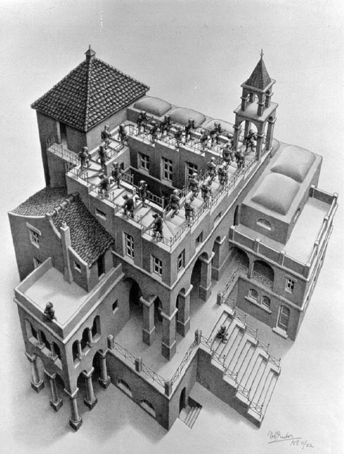 Ascending and Descending ,1960 Lithograph, by M.C. Escher
See many more of his mind-boggling eye-candies at the offical website:
http://www.mcescher.com
Time – Temporal Clues to Perspective
Drawing perspective in TIME is even closer to simulating what goes on in our brain when we try to understand the world around us.
Every single cue listed above is ten times more powerful in motion than in a still image.
What our brain is really good at is comparing things.
Compare one image to the one that came before it.
It goes something like this: “Oh, that train looks a lot bigger now that it did a second ago – guess I’d better move out of the way!”
You can use all of these cues, these tools for vision, to bring your work to life.
Our brain always prefers the short-cut!
If it didn't – there would be no drawings, and no cinema.
But it does – So when an image gets bigger, our brain think it’s getting closer, and we duck – or clutch the popcorn :-)
You might also like
How to draw a corridor perspective
Drawing with Flash - Draw an orange cat :-)
Home > Learning to Draw > Drawing Perspective
Figure Drawing Journal:
In This Section
Basics:
More Drawing Tuts:
anatomy- the movement of the spine
drawing perspective with a single vanishing point

